Back to overview

Svelte transitions

▼ Post information

Author Jef Meijvis Publish date 09/02/2023
Title Svelte transitions Id 10
Source 010-svelte-transitions.md Render timestamp Dec 06, 2023, 06:08:31 AM (GMT+1)
Views 139 Tags svelte, sveltekit, frontend
Author Jef Meijvis
Publish date 09/02/2023
Title Svelte transitions
Id 10
Source 010-svelte-transitions.md
Render timestamp Dec 06, 2023, 06:08:31 AM (GMT+1)
Views 139
Tags svelte, sveltekit, frontend
opengraph

▼ Table of contents

Share this post:

Svelte transitions

Svelte allows us to easily animate elements in and out of the DOM. A transition is an animation that plays when the element get created or deleted. They work in both directions, meaning that the animation that plays on deletion will be the inverse of the animation that plays on creation. To to achieve all of this this, we can make use of the transition directive.

Basic example

We can add the transition directive to native dom elements, such as a paragraph tag in this example:

Code snippet

1
<script>
2
    // Import the build-in fade transition
3
    import { fade,blur,fly } from 'svelte/transition';
4
    let showText = true;
5
</script>
6

7
<input type="checkbox" bind:checked={showText}>
8

9
{#if showText}
10
    <p transition:fade>
11
        I will fade in and out!
12
    </p>
13
{/if}

The paragraph fades in an out when the DOM elements get added or removed

Image: The paragraph fades in an out when the DOM elements get added or removed

Out-of-the-box transitions

At the time of writing, Svelte comes with a couple of transitions out-of-the-box:

  • blur
  • fade
  • fly
  • slide
  • scale
  • draw
  • crossfade

Fade

Image: Fade

Blur

Image: Blur

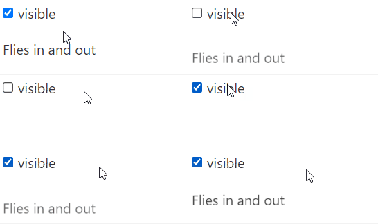
Fly

Image: Fly

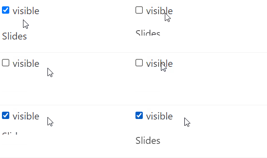
Slide

Image: Slide

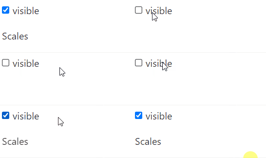
Scale

Image: Scale

The draw transition is a special one, as it can only be applied to an SVG path. The following inline SVG drawing of a cross gets drawn by the transition Draw
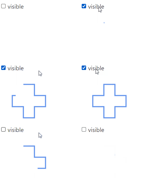
Image: Draw

Code snippet

1
// Animate the drawing of the SVG path using the 'Draw' transition
2
<svg viewBox="0 0 5 5" xmlns="http://www.w3.org/2000/svg">
3
    {#if visible}
4
        <path transition:draw="{{duration: 1500}}"
5
                    d="M2 1 h1 v1 h1 v1 h-1 v1 h-1 v-1 h-1 v-1 h1 z"
6
                    fill="none"
7
                    stroke="cornflowerblue"
8
                    stroke-width="0.1px"
9
                    />
10
    {/if}
11
</svg>
12

13
<style>
14
    svg {
15
        display: block;
16
        height: 150px;
17
        width: 150px;
18
    }
19
</style>

Some of these transitions require additional parameters to work. All available options can be viewed under the Transitions source code on Github. As an example, the Fly transition can be given the y parameter (in pixels) and the duration (in ms).

Code snippet

1
    <p transition:fly="{{ y: 50, duration: 1000 }}">
2
        Flies in and out
3
    </p>

Custom transitions

While these transitions probably cover most use cases, we might someday require a custom transition. We can define these custom transition function as follows:

Code snippet

1
<script>
2
    let visible = true;
3
    function myfade(node, {delay = 0,duration = 200}) {
4
    return {
5
        delay,
6
        duration,
7
        css: t => 
8
        {
9
            return `font-size:${t}rem;`;
10
        }
11
    };
12
}
13
</script>
14

15

16

17
<label>
18
    <input type="checkbox" bind:checked={visible}>
19
    visible
20
</label>
21

22
{#if visible}
23
    <p in:myfade="{{duration: 500}}" out:myfade>
24
        customTransition!
25
    </p>
26
{/if}
27

28
<style>
29
    p,label{text-align:center}
30
</style>

The function takes in two arguments:

  • node
  • options object

The first one is the node that is the subject of the transition. The second argument is an object that contains any options you want to pass to the transition function, such as the duration, direction, color, ...

The function needs to return an object that can contain the following properties:

  • delay: The duration (in ms) before the transition begins
  • duration: The total duration of the transition
  • easing: An (input : number) => output : number function that maps the input between [0,1] to the output [0,1], but with a tweening function.
  • css: A function (t,u) = {..} that returns a string containing the relevant css for the node. Parameter t goes from 0,1, while parameter u goes from 1 to 0. t = u - 1 for the entire duration of the function
  • tick: Similar to the css function in the shape of (t,u) => {..} that can modify the node. Usually not needed, as the css function should be enough to modify the styling of the node.

A typical css function looks as follows:

Code snippet

1
css: (t,u) => 
2
        {
3
            return `font-size:${t}rem;`;
4
        }

The function above would generate a CSS animation that changes the font size from 0rem to 1rem when the element gets created, and from 1rem to 0rem when destroying the object. This example only changes the font-size, but as many css properties as needed can be modified during a transition.
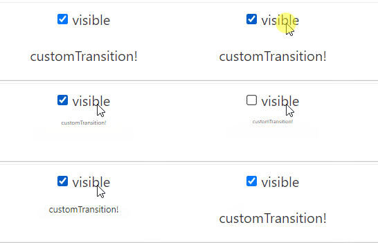
Custom font-size transition

Image: Custom font-size transition

Layout transitions

Up until this point we have been applying transitions to single elements on a page. Of course we can also apply them to divs or other container elements.

But it gets even more interesting when applying transitions in a layout file. When we create a +layout.svelte file, we can apply a transition in the following way:

Code snippet

1
    <!-- +layout.svelte -->
2
    <div transition:fly="{{ y: 50, duration: 1000 }}">
3
        <slot></slot>
4
    </div>
5

6
    <style>
7
    div
8
    {
9
        position: absolute;
10
    }
11
    </style>

This will fade the entire content slot in and out. We add the absolute position tag to the div so that both slots are rendered on top of each other. This will prevent popping in when the original div disappears from the DOM.

I've set up a live demo at Post 10 demo When using the code as shown above, we get the following result: Layout fly transition

Image: Layout fly transition

This works great! All the content in the slot tag flies in and out when a new page gets loaded.

Directional transition

Now in case of the fly transition, we might want to detect the 'direction' of the transition. By this I mean that it could be useful to detect if we are moving from a deeply nested page to a more shallow nested page. For example:

  • moving from 'demo/010' to 'demo/010/1' would be considered moving deeper, or moving right
  • moving from 'demo/010/1' to 'demo/010' would be considered moving more shallow, or moving left

In the +layout.svelte file, we can determine the transition direction to be either LEFT or RIGHT be looking at the path depth. The depth is determined in the layout by using the 'beforeNavigate' hook.

Code snippet

1
<!-- +layout.svelte -->
2
<script lang="ts">
3
    let direction : "LEFT" | "RIGHT";
4
    
5
    beforeNavigate(DoBeforeNavigate)
6

7
    function DoBeforeNavigate(navigation : BeforeNavigate)
8
    {
9
        let from : string = navigation.from?.route.id ?? "";
10
        let to : string = navigation.to?.route.id ?? "";
11

12
        let depthFrom = from.split("/").length;
13
        let depthTo = to.split("/").length;
14

15
        if(depthFrom > depthTo)
16
            direction = "LEFT"
17
        else
18
            direction = "RIGHT"
19
    }
20
</script>

We can use this direction in the same layout file to generate the options object that gets passed on to the fly transition, like so:

Code snippet

1
<script lang="ts">
2
    function getFlyIn(direction : "LEFT" | "RIGHT")
3
    {
4
        let directionSign = direction == "LEFT" ? -1 : 1;
5

6
        return {
7
            x : directionSign * 500,
8
            duration : 500
9
        }
10
    }
11

12
    function getFlyOut(direction : "LEFT" | "RIGHT")
13
    {
14
        let directionSign = direction == "LEFT" ? -1 : 1;
15

16
        return {
17
            x : -directionSign * 500, // minus sign because the out direction is reversed
18
            duration : 500
19
        }
20
    }
21
</script>
22

23
<h2>Sveltekit transitions demo</h2>
24
<p>This interactive demo is part of <a href="/blog/010-svelte-transitions">Blogpost 10: Svelte transitions</a></p>
25
<p>The current path is <b>{$page.url.pathname}</b></p>
26
{#key $page.url.href}
27
    <div in:fly={getFlyIn(direction)} out:fly={getFlyOut(direction)}>
28
        <slot></slot>
29
    </div>
30
{/key}
31

32
<style>
33
    div
34
    {
35
        position: absolute;
36
    }
37
</style>

And by doing so, we reverse the transition direction going back up the url tree. You can view the result live at the Post 10 demo page. Layout fly transition

Image: Layout fly transition

Getting creative

The Batman transition

All of this of course leads to one single goal: the batman transition. The original batman series featured a spinning bat logo and matching sound effect. I've recreated this as a Svelte page transition. The sound is played by the afterNavigate hook, and a custom transition scales and rotates the logo when the url changes.
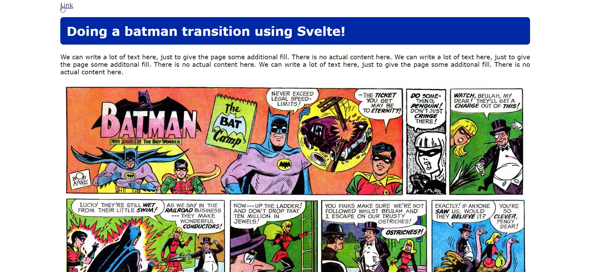
Code snippet

1
<script lang="ts">
2
    import { afterNavigate } from "$app/navigation";
3
    import { page } from "$app/stores";
4

5
    afterNavigate(()=> {
6
        var audio = new Audio('/batman.mp3');
7
        audio.play();
8
    })
9

10
    let easingFunction = (t : number) => 2*(-4 * ((t-0.5)*(t-0.5)) + 1);
11

12
    function batmanTransition(node : any, {delay = 0,duration = 2000}) {
13

14
    return {
15
        delay,
16
        duration,
17
        css: (t : number,u : number)  => 
18
        {
19
            let scale = easingFunction(t);
20
            return `transform:scale(${scale});`;
21
        }
22
    };
23
}
24

25

26
    function fadeTransition(node : any, {delay = 0,duration = 2000}) 
27
    {
28
        return {
29
            delay,
30
            duration,
31
            css: (t : number,u : number)  => 
32
            {
33
                let scale = 1 + easingFunction(t);
34
                return `transform:rotate(${ t * 720 }deg) scale(${scale});`;
35
            }
36
        };
37
    }
38
</script>
39

40
{#key $page.url.href}
41
    <div in:fadeTransition="{{}}">
42
        <slot></slot>
43
    </div>
44
    <div in:batmanTransition="{{}}" class="batman-logo">
45
        <img src="/batman-1965.png" alt="batman logo"/>
46
    </div>
47
{/key}
48

49
<style>
50
    .batman-logo
51
    {
52
        width : 100vh;
53
        display: block;
54
        left : 25%;
55
        top : 0;
56
        pointer-events: none;
57
        transform: rotate(0deg) scale(0);
58
        transform-origin: 50% 50%;
59
        transition: all ease .5s;
60
        position: fixed;
61
    }
62

63
    img
64
    {
65
        width : 100%;
66
        height : 100%;
67
        filter: invert(13%) sepia(94%) saturate(3733%) hue-rotate(354deg) brightness(89%) contrast(120%);    }
68
</style>

I have peaked as a web developer

Image: I have peaked as a web developer

Accessibility

As mentioned in this great blogpost by Geoff Rich, we need to make sure that we keep the accessibility of our webpage in mind. Its easy to go wild with all these easy-to-use animations, but at the end of the day we want our website to be usable to all users.

Code snippet

1
<style>
2
  @media (prefers-reduced-motion: reduce) 
3
  {
4
    * {
5
      animation-duration: 0.01ms !important;
6
      animation-iteration-count: 1 !important;
7
      transition-duration: 0.01ms !important;
8
      animation-delay: 0.01ms !important;
9
    }
10
  }
11
</style>

The following css media query at the root level in our app.html file will detect if the user prefers reduced motion. If this is the case, we will disable all animations across the entire website.

As a reminder, you can enable this setting on your device or browser in the following way:

  • In GTK/Gnome, if gtk-enable-animations is set to false. This is configurable via GNOME Tweaks (Appearance tab or General tab, depending on version). Alternately, add gtk-enable-animations = false to the Settings block of the GTK 3 configuration file (~/.config/gtk-3.0/settings.ini).
  • In Windows 10: Settings > Ease of Access > Display > Show animations in Windows.
  • In Window 7 [& 8]: Control Panel > Ease of Access > Make the computer easier to see > Turn off all unnecessary animations (when possible).
  • In macOS: System Preferences > Accessibility > Display > Reduce motion.
  • In iOS: Settings > General > Accessibility > Reduce Motion.
  • In Android 9+: Settings > Accessibility > Remove animations.

Information found on this StackOverflow question

Further reading

Back to top